Case study
Challenge
EES approached us when they decided to refresh their brand which was essentially a Victorian Seal.
- Our biggest challenge was to develop a new logo, which continued to represent the heritage of the Society while introducing a more modern look and feel.
- We were aware that our design would need to be approved by sensitive internal audiences before it could be put into effect externally.
Solution
- We undertook focus group meetings with internal stakeholders to gain an understanding of how much change the organisation was ready to make.
- We developed a choice of options ranging from a purely typographical solution to a more illustrative approach.
- The response to these gave us a clear understanding of how far we could take our designs – which turned out to be quite a long way!
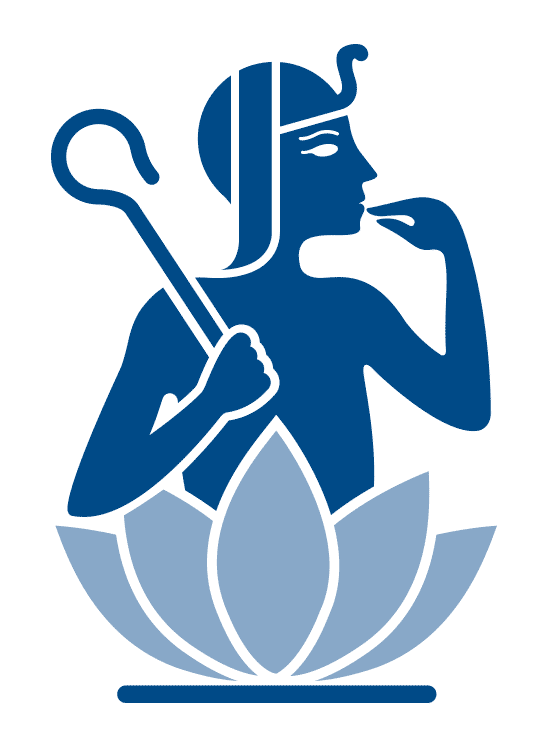
- The distinct design replaces black ink with blue, reflecting authority, expertise, trust and intelligence and features an iconic Horus child sitting on top of an open lotus flower.
- We created a solution which enhances the strengths of the previous logo – such as the Egyptian imagery – and addresses the problems we found during our research – such as legibility.
Results
- The new logo is bold and contemporary but instantly recognisable.
- This unmistakably Egyptian imagery appropriately symbolises rebirth and regeneration and signals a new cycle in the Society’s growth.
- Audiences have responded well to the new look and it is currently being used across all EES print and digital publications including the EES e-newsletter, the Annual Report and Egyptian Archeology magazine.


