Chris Michaeloudis on why the power shift created by the digital revolution requires a bold approach to branding.
We’re in the midst of a digital revolution and these days the consumer really is king.
Branding is no longer a one-way communication – the impact of consumer behaviour on the internet, social media and mobile has been radical. Brands can no longer push their messages to a passive audience, they have to engage.
So now it’s a two-way street; people have control over how they interact with your brand and what they say about it to huge online audiences. Assuming you have a good product, this a great opportunity – the chance to interact with your audience, get fast feedback, adapt and succeed. But you need to be prepared for this level of engagement and the first ‘must-have’ is a strong, consistent and empathetic brand identity.
How can you ensure your brand stays relevant in our digital world?
A consistent approach
Digital or no digital your brand identity should communicate what is unique about your organisation. Your visual identity is the embodiment of your brand identity and as such should reflect your vision, mission and values. Use a consistent tone of voice and messaging to explain to your audience why you exist, not just that you exist. The difference is that now this needs to be rolled out consistently across all your print and digital platforms.
Consumers should have a seamless experience of your brand whether they are on your website, skimming your Twitter profile, reading a printed newsletter or on your premises. A good example of this is Premier Inn – whether you’re on their website, on their mobile site, on their app or in a hotel – the experience is unbroken and consistent.
Understand your audience and make it personal
Knowing the views and behaviours of your audience has never been more important. What motivates them? What keeps them awake at night? How do they like to get information about your organisation – twitter, email, post?
You may find that your audience segments by age or socio-economic backgrounds across different digital media and this could help you personalise and adapt your brand across different platforms, while maintaining an overall consistency.
And be considerate; think about what your audience wants to hear not just what you want to tell them. If you can keep your audience engaged with genuinely useful and interesting information which supports your brand, you are more likely to generate a loyalty and trust in your audience which will pay dividends over time.
Be practical
Brand consistency today is not just about making sure your logo is in the right position, using the correct font and colours. It’s about having a visual identity that works off-line and on-line. Here are three practical things to consider when you embark on a new brand identity.
1. Select the right font
What might look beautiful on a printed page might not work so well on a scrolling mobile phone screen. Choose a font that is not only distinctive and appropriate but which is also readable across all digital formats.
2. Ensure your visual identity works on multiple devices
Because people engage with online content in so many different ways – smart phone, tablets, desktops and more – your digital brand must work across all devices.
3. Optimise your logo
Your logo needs to be optimised so it is easily recognisable across all of your platforms. From social media thumbnails to mobile typography you will need to consider size, shape and legibility.
Examples of brands that have optimised their logos for digital:
1. Google sharpens its act
The new sans serif google logotype is scalable and works well no matter how small your screen. It retains the distinct multi-coloured sequence already well-established and combined with the slightly rotated ‘e’, the new logo is simple and friendly while retaining its quirkiness.

2. Instagram makes it clear
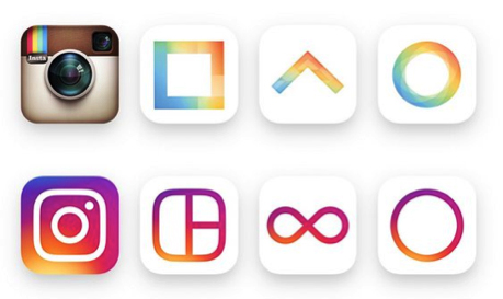
Last year Instagram introduced a much simpler camera icon and new app icons to make it easier for people to navigate and to shift focus on the images and videos. They maintained their rainbow effect but in a simpler gradient form.

3. Mastercard keeps it simple
The new Mastercard logo reflects the organisation’s readiness to embrace the seamless payment choices consumers now have. The new logo is clean, modern and optimized for the digital world.
