Data is big these days and transforming complicated statistics into something accessible and thought-provoking is something of a nim speciality. Sometimes we call these infographics and here are a few we made earlier.
Infographics Design in London
Simplifying complex data into clear infographics


Malaria Consortium
Malaria Consortium approached us to help them communicate some of the complicated information they needed to convey in a policy document.
We placed powerful statistics in striking infographics alongside clear illustrations to give impact to the information. The results are simple to understand and pack a punch in a way which could never be achieved by simple text or pictures.
Challenge
The client briefed us to produce infographics to add impact to an existing policy document. This presented some unique challenges:
- The infographic designs needed to blend and merge well with the rest of the policy document and conform to existing guidelines.
- At the same time, they needed to be strong enough to work as stand-alone designs – outside of the main document – and to be scalable for other platforms.
- The information supplied was complex, detailed and academic.
Solution
- We analysed the data sets to develop a visual response that would bring the story to life.
- We gave consideration to how much time audiences had to consume the infographic.
- We ensured the infographic had integrity, meaning, was sharable and was on-brand.
Results
- Malaria Consortium’s story was told more effectively as a result of our infographics.
- The infographics were used by the client across multiple platforms.
- Positive feedback from readers suggested that the infographics had helped them better understand the complex messaging.


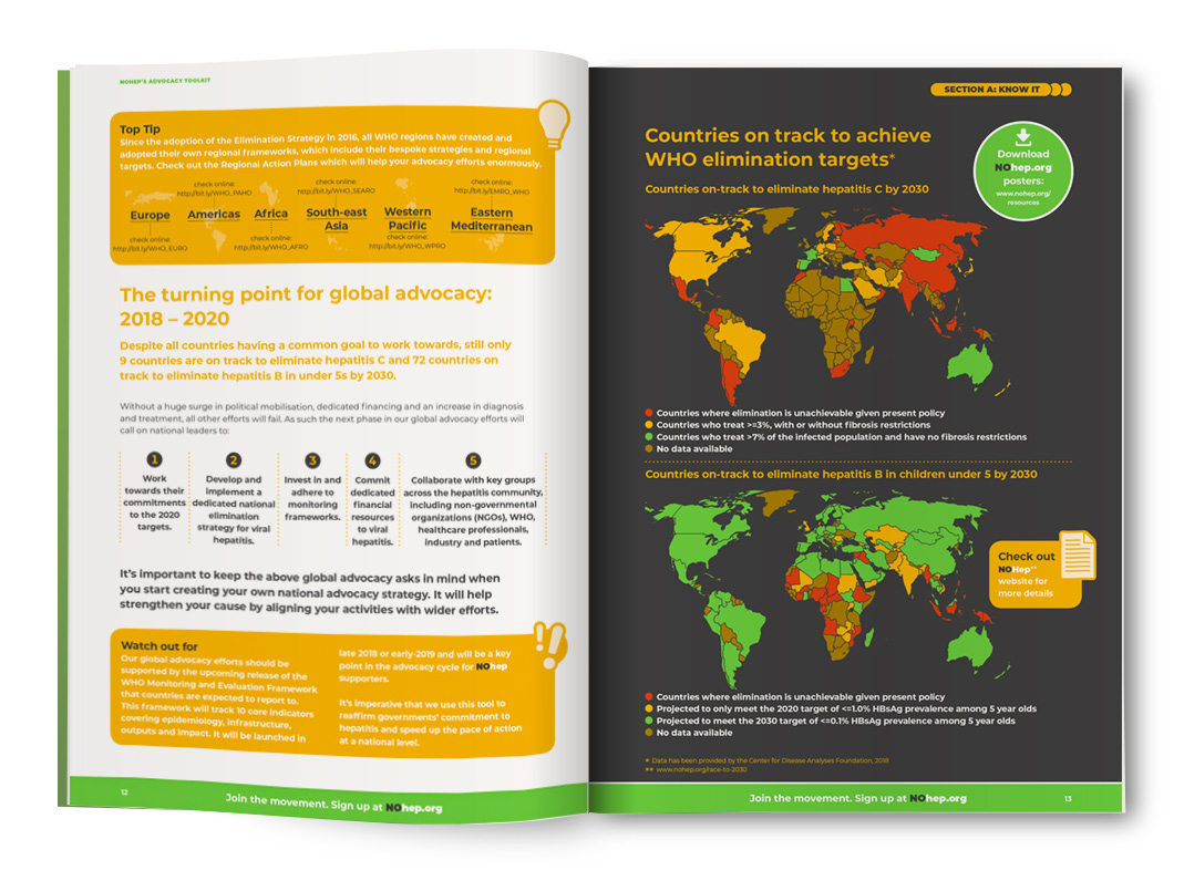
World Hepatitis Alliance – NOhep campaign
NOhep is a global movement set up by the World Hepatitis Alliance to eliminate viral hepatitis by 2030. Our brief was to create a resource which would help patient organisations all over the world fight for NOhep in their own countries.
We designed an online toolkit which offers well-defined copy hierarchy, clear navigation and interactive links to reports, videos and resources. We introduced illustrations, icons and infographics to draw attention to key facts and features and used high-impact photography to signpost new segments.


Duke of Edinburgh’s International Award
This organisation drives the DofE Award’s global growth to encourage more young people to participate in the world’s leading youth achievement Award.
To boost participation from youth, volunteers, funders and operators around the world, the DofE Foundation has collected statistics which demonstrated the positive impact of the Award. We were briefed to create a leaflet to be distributed at The Duke of Edinburgh’s International Award 2018 Forum in Accra, Ghana, in July 2018.
We proposed a bright, fun A6 concertina fold-out leaflet, which offers a global snapshot of the ‘Award in numbers”. It is inspired by the journey taken by a DofE participant. A colourful line links all the pages together and they are packed with bold infographics using the stats supplied by the client which describe the many benefits of participation.
After the International Forum our infographic leaflet design was adopted by DofE Award Operators in Australia, Canada and China.

RMBI
The Royal Masonic Benevolent Institution (RMBI) has been caring for older Freemasons and their dependants and the wider community since 1842.
We designed an infographic poster, filled with colourful illustrations, to give a snapshot of all the benefits that employees at RMBI can take advantage of.

Safe Child Thailand
Safe Child Thailand has been working to protect children in Thailand for over 30 years.
This charity approached us to produce their annual review to help them communicate their work and to show how and where donations are spent. The infographics shown here are a part of that review.


Barnsbury Housing Association
Barnsbury is a small neighbourhood-based housing association, formed in 1967 to provide genuinely affordable rented housing in Barnsbury, Islington. Today, they provide 299 homes throughout Islington.
To help Barnsbury communicate their longevity, impact and the location of their homes, we designed a timeline, a colourful performance survey document and a map.
We ensured the information is visually engaging and well branded.


Girls Not Brides
The information provided to us for GNB’s 5-year progress report was detailed and extensive. To ensure we could communicate these important statistics with clarity and effect, we transformed the figures into graphs, illustrations and graphics. In addition, we used a variety of font sizes and spacing to ensure the report looked inviting and read well; readers can easily scan the pages to gather the most important information first, and then read further if they wish to.

Greensleeves Care
Greensleeves Care manages 20 care homes for older people across England.
The client was looking for a way to illustrate the impact of the organisation’s work so we used their latest research to create an infographic.
We applied their vibrant brand colours to give this piece a fresh, contemporary feel and warm photographs of people and places which kept the tone upbeat. Our choice of a clean, bold font meant that the powerfully positive statistics supplied by the client were transmitted with clarity.
This a useful example of how an infographic can communicate a great deal of information on one page – perfect for social, digital media and traditional media. Unlike straightforward copy, an infographic also provides an opportunity to reinforce brand values through strong graphic design. We turned around this job in half a day.
We are very pleased with the infographic which nim design produced for us, showcasing the Greensleeves Care’s achievements of the past year. The graphic design team came up with great ideas and the final design exceeded our expectations. Thank you nim design.
Anna Kleinman
Marketing & Communications Manager, Greensleeves Care

John Lyon School Fundraising
The John Lyon School is one of the top 20 independent boys’ school in the country and is part of the Harrow School Foundation.
Situated just around the corner from our studio, this school is a close neighbour and very much part of our local community. We have been delighted to work with the school on a number of projects and on this occasion staff were looking to boost fundraising. The team wanted to communicate detailed information about how funds were spent and the benefits this delivered. We recommended that, rather than put these specifics into paragraphs of copy, they considered creating an infographic.
We kept to the school colours of blue and gold and originated some graphic icons to represent key elements such as money raised, tickets sold and goals scored. The result is a fun, dynamic and pleasing infographic which delivers a lot of information in a very digestible format. It presents a forward-facing image for this historic school while maintaining an appropriate tone of voice to encourage fundraising.

RMBI
When we were asked to design a well-being booklet to promote healthy lifestyle options for staff at the Royal Masonic Benevolent Institution (RMBI), we were careful to avoid delivering a prescriptive list of how to live.
Instead, we chose to use strong and colourful illustrations as well as simple-to-read infographics to communicate tips and ideas around positive opportunities for change. The result was a booklet which is fun and interesting to read and that delivers content in a non-condescending way.


Certitude
The Annual Review was designed both as a print publication and interactive microsite, using the brand assets to ensure a consistent look and feel. We designed both static (print) and interactive (microsite) infographics using the leaf motif to highlight key achievements and make the financials more accessible and engaging.


Lemon Tree Trust
The work of the Lemon Tree Trust is innovative and unusual. Communicating its key concepts and processes such as greening innovation and urban agriculture to the first ever World Humanitarian Summit in Turkey would be a challenge. We created an over-arching infographic for their report which clearly set out their underlying proposition. This simple format laid out the advantages of their approach and set the scene for the detail contained in the rest of the report.

Article 19
Defending freedom of expression and information worldwide is quite an abstract concept to visualise. We chose to use a map infographic to highlight the areas of training delivered by Article 19 worldwide which gave readers a pictorial overview of the organisation’s key areas of work and the geographic regions where it happens.

Plan International – Day of the African child
These powerful infographics tell the story of how far children have to travel to find safe sources of water in East and West Africa, compared to children in OECD member countries and the UK in particular. From the raw data, we developed the story and created striking infographics that instantly highlight the differences.


Plan International – Youth Advocacy Toolkit
Plan International required a robust toolkit to help children and young people advocate for a better education for themselves. We illustrated the step-by-step approach with youthful and engaging graphics and limited text. This document was about delivering strong messages and we led by example, using infographics to create a genuinely useful document which was presented at an international summit in Washington attended by the then UN General Secretary Ban Ki-moon.